Data Visualization - 2
The visualization of data in R offers much more possibilities than the examples shown in the introduction. Several templates that are helpful in everyday work are presented.
Setting up the environment
rm(list=ls())
rootDIR="~/desk/spatialstat_SoSe2020/"
## load the needed libraries
# we first define a list with the package names and
# then use a for loop that takes each element from the list
# and see if it is already installed utils::installed.packages()
# if not it will be installed
libs= c("sf", "mapview", "tmap", "tmaptools", "spdep", "ineq", "cartography", "spatialreg", "ggplot2", "usedist", "raster", "downloader", "RColorBrewer", "colorspace", "viridis")
for (lib in libs){
  if(!lib %in% utils::installed.packages()){
    utils::install.packages(lib)
  }}
# don't be surprised lapply()is a built-in for loop that loads all packages contained in the vector libs
# packages contained in the vector libs by passing the package name as a character string to the
# function library
invisible(lapply(libs, library, character.only = TRUE))
#---------------------------------------------------------
# nuts3_autocorr.R
# Author: Chris Reudenbach, creuden@gmail.com
# Copyright: Chris Reudenbach 2020 GPL (>= 3)
#
# Description: script calculates different autocorrelations from the circle data.
#
#--------------------
##- Loading the circle data
#--------------------

# From session one, the cleaned circle data is loaded from github and read in.

download(url ="https://raw.githubusercontent.com/GeoMOER/moer-mhg-spatial/master/docs/assets/data/nuts3_kreise.rds", destfile = "nuts3_circles.rds")

# read in the nuts3_circles data
nuts3_circles = readRDS("nuts3_circles.rds")
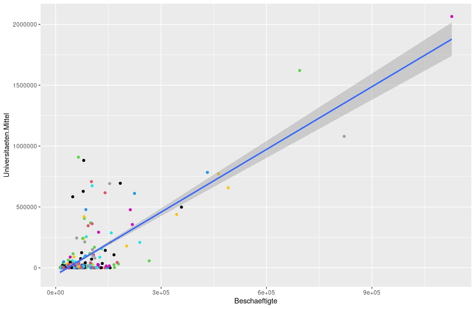
Traditional regression visualization and analysis
We have neglected the visualization of linear models so far. besides the R-based visualization, the extremely powerful package ggplot is a good choice. It is based on the same semantics of the “grammar of graphics” already presented for tmap.
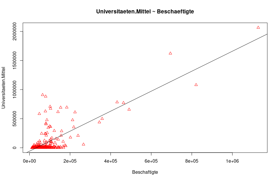
As an example we take our OLS model. The normal plot() function gives us some important graphics for the visual analysis which can be switched by pressing enter.
lm_um = lm(universities.means ~employees, data=nuts3_circles)
summary(lm_um)
##
## Call:
## lm(formula = universities.means ~ employees, data = nuts3_circles)
##
## Residuals:
## Min 1Q Median 3Q Max
## -341649 -40552 -7942 16099 856057
##
## Coefficients:
## Estimate Std. Error t value Pr(>|t|)
## (Intercept) -5.839e+04 7.579e+03 -7.704 1.06e-13 ***
## Employees 1.718e+00 6.566e-02 26.167 < 2e-16 ***
## ---
## Signif. codes: 0 '***' 0.001 '**' 0.01 '*' 0.05 '.' 0.1 ' ' 1
##
## Residual standard error: 120900 on 398 degrees of freedom
## Multiple R-squared: 0.6324, Adjusted R-squared: 0.6315
## F-statistic: 684.7 on 1 and 398 DF, p-value: < 2.2e-16
plot(nuts3_circles$employed,nuts3_circles$universities.means, pch = 2, cex = 1.0, col = "red", main = "universities.means ~ employed", xlab = "employed", ylab = "universities.means")
# add the regression line
abline(lm_um )
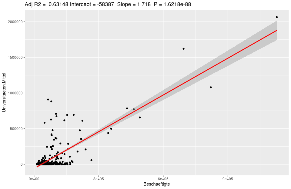
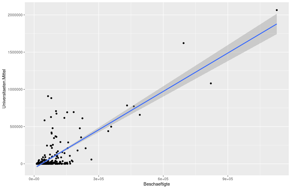
 In the following figure, this is calculated and plotted directly with
 ggplot.
# calculate and plot the regression model lm_um
ggplot(nuts3_circles, aes(x = employees, y = universities.means)) +
  geom_point() +
  stat_smooth(method = "lm")

Of course, labels and many other settings can be manipulated.
# initializes the base dataset
  ggplot(lm_um$model, aes_string(x = names(lm_um$model)[2], y = names(lm_um$model)[1]) +
# for the scatterplot add
    geom_point() +
# sttistic smoothingif too much data is corhanden
    stat_smooth(method = "lm", col = "red") +
# add the title using the model data stored in lm_um
    labs(title = paste("Adj R2 = ",signif(summary(lm_um)$adj.r.squared, 5),
                       " Intercept =",signif(lm_um$coef[[1]],5 ),
                       " Slope =",signif(lm_um$coef[[2]], 5),
                       " P =",signif(summary(lm_um)$coef[2,4], 5))
For automation, it can be written as a function very easily used for any model.
ggplotRegression <- function (fit,method="lm") {

ggplot(fit$model, aes_string(x = names(fit$model)[2], y = names(fit$model)[1]) +
  geom_point() +
  stat_smooth(method = method, col = "red") +
  labs(title = paste("Adj R2 = ",signif(summary(fit)$adj.r.squared, 5),
                     "Intercept =",signif(fit$coef[[1]],5 ),
                     " Slope =",signif(fit$coef[[2]], 5),
                     " P =",signif(summary(fit)$coef[2,4], 5))
}

ggplotRegression(lm(Universities.Means ~ Employees, data=nuts3_circles))

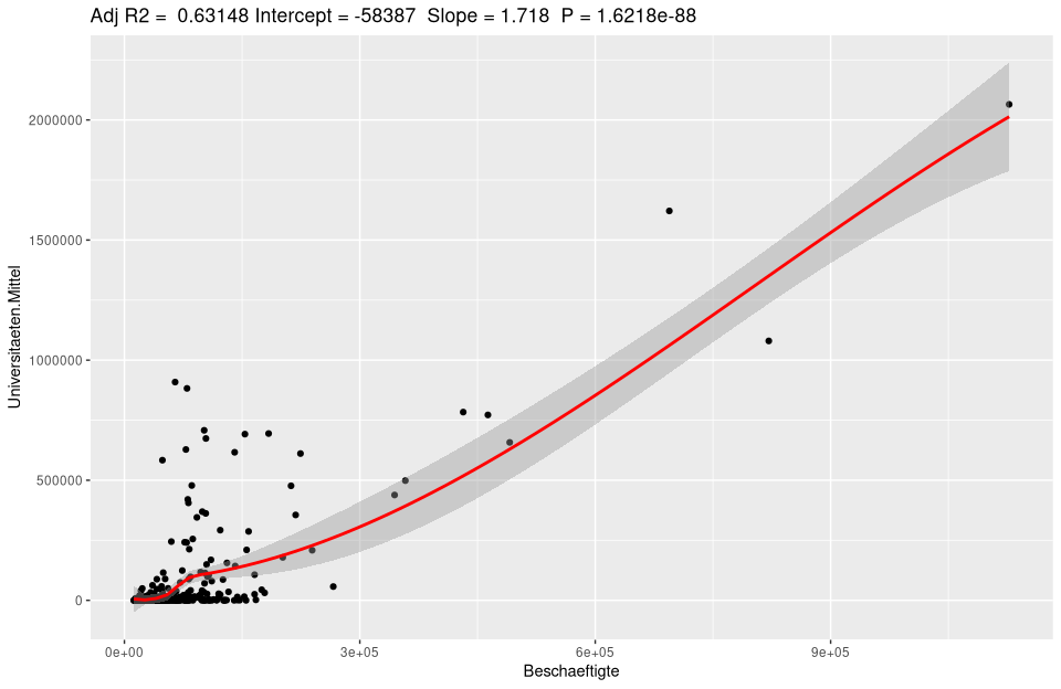
# loess model (Locally Weighted Scatterplot Smoothing)
ggplotRegression(lm(Universities.Means ~ Employees, data=nuts3_circles),method = "loess")
Regression analysis with ggplot
To analyze a regression model there is a typical procedure. Besides the simple plots shown, analytical plots are very useful. If we plot our lm_um model we get the following 4 figures:
par(mfrow = c(2, 2))
plot(lm_um)
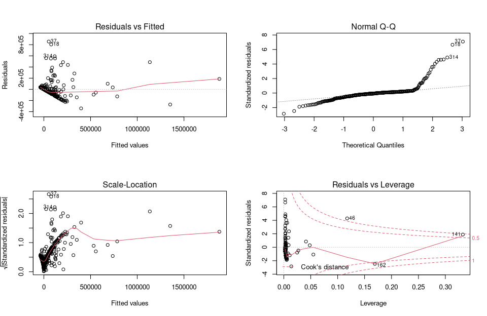
par(mfrow = c(1, 1))
They provide a traditional method for interpreting residuals and visually analyzing whether there may be problems with the model.
Figure 1 (Residuals vs fitted) shows whether the residuals have nonlinear patterns. There could be a nonlinear relationship between predictor variables and an outcome variable, and the pattern could show up in this plot if the model does not capture the nonlinear relationship. Figure 2 (Normal Q-Q) shows whether the residuals are normally distributed. Do the residuals follow a straight line or do they deviate significantly? Figure 3 (Scale Locattion) shows whether the residuals are evenly distributed across the ranges of the predictors. In this way, the assumption of equal variance (homoscedasticity) can be checked. It should be a horizontal line with uniformly (randomly) distributed points. Figure 4 (Residuals vs Leverage) This plot helps us to influential outliers exist. As a rule of thumb, marginal values are considered in the upper right corner or in the lower right corner. Outliers outside of Cook’s distance are important. If we exclude these cases, the regression results will be altered.
This usual approach can be extended seh relegantly by ggplot. Here we again follow the usual approach:
1 Fitting a regression model to predict variable (Y). 2 Determining predicted and residual values associated with each observation on (Y). 3 Visualization of the actual and predicted values of (Y). 4 Analyzing the residuals to provide a visual interpretation (e.g., red color when the residuals are very high) to highlight points that are poorly predicted by the model.
# 1) Standrd ggplot of the regression model.
ggplot(nuts3_circles, aes(x = employees, y = universities.means)) +
  geom_point() +
  stat_smooth(method = "lm")
# 2) Assignment of prediction and residual values into nuts3_circles object
nuts3_circles$predicted <- predict(lm_um)
nuts3_circles$residuals <- residuals(lm_um)
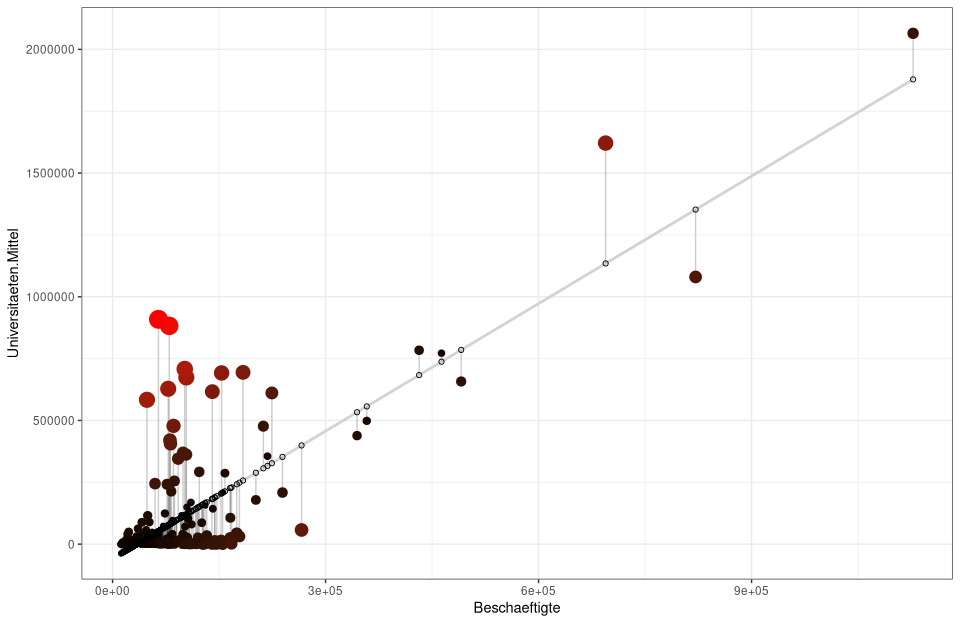
# repeat of 1) only here the confidence interval is hidden se=FALSE, and lightgrey is set as the color for the gereade
# geom_segment draws lines between the predicted values and residuals while alpha makes the lines transparent
ggplot(nuts3_circles, aes(x =employed, y =universities.means)) +
geom_smooth(method = "lm", se = FALSE, color = "lightgrey") +
geom_segment(aes(xend = employed, yend = predicted), alpha = .2) +
# Here the sizes and colors of the residuals are generated
geom_point(aes(color = abs(residuals), size = abs(residuals)) +
scale_color_continuous(low = "black", high = "red") +
guides(color = FALSE, size = FALSE) +
geom_point(aes(y = predicted), shape = 1) +
theme_bw()
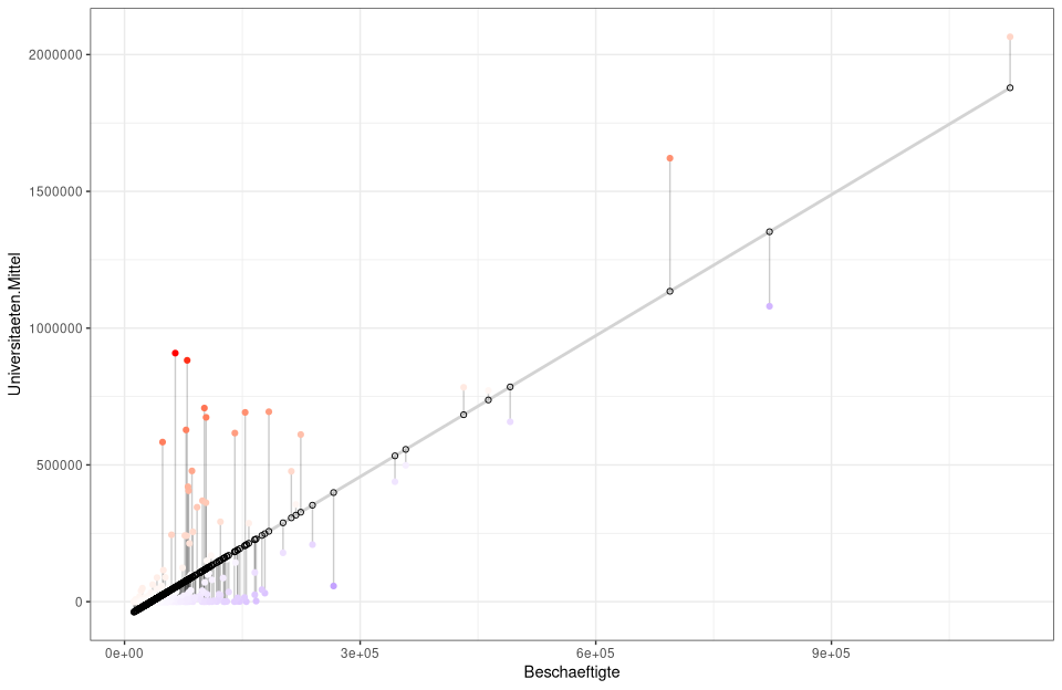
# alternatively with colors and without sizes
ggplot(nuts3_circles, aes(x = employees, y = universities.means)) +
  geom_smooth(method = "lm", se = FALSE, color = "lightgrey") +
  geom_segment(aes(xend = employed, yend = predicted), alpha = .2) +
  geom_point(aes(color = residuals)) +
  scale_color_gradient2(low = "blue", mid = "white", high = "red") +
  guides(color = FALSE) +
  geom_point(aes(y = predicted), shape = 1) +
  theme_bw()
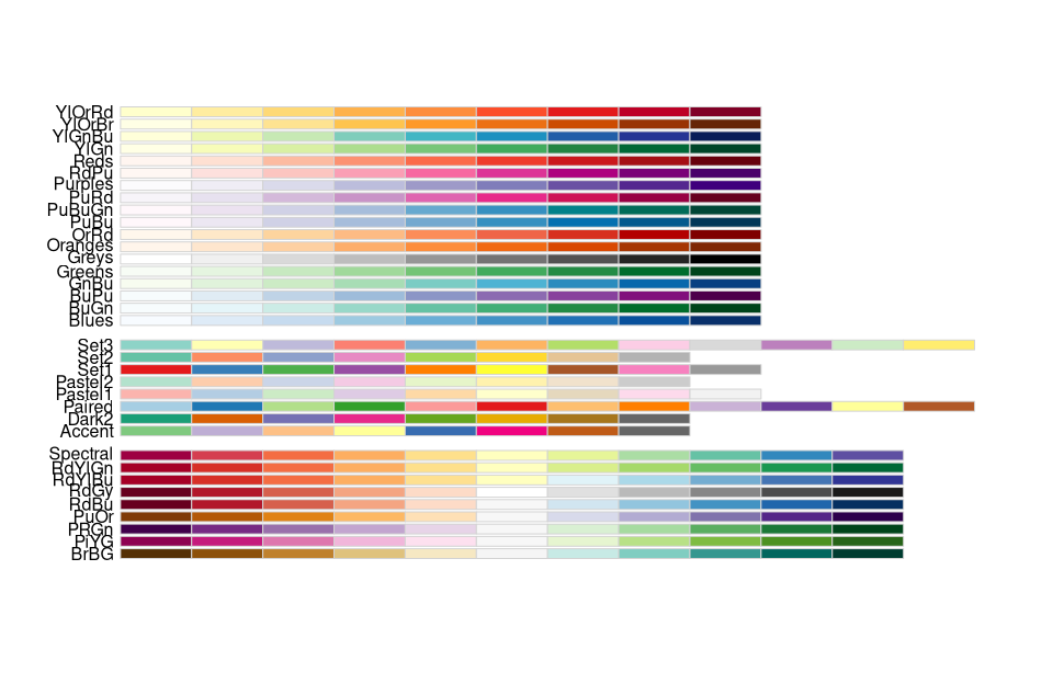
Color palettes in R
Color assignment in maps and plots is a separate and quite complex chapter in ‘R’. The basic concept is simple - so called R color palettes are used to change the default colors. This applies equally to diagrams with ggplot or the R-base plot functions or also maps with tmap
Perhaps the most important color palettes are available in various R packages:
- Viridis color palettes [viridis package].
- Colorbrewer palettes [RColorBrewer package].
- Gray color palettes [ggplot2 package].
- Color palettes for scientific journals [ggsci package].
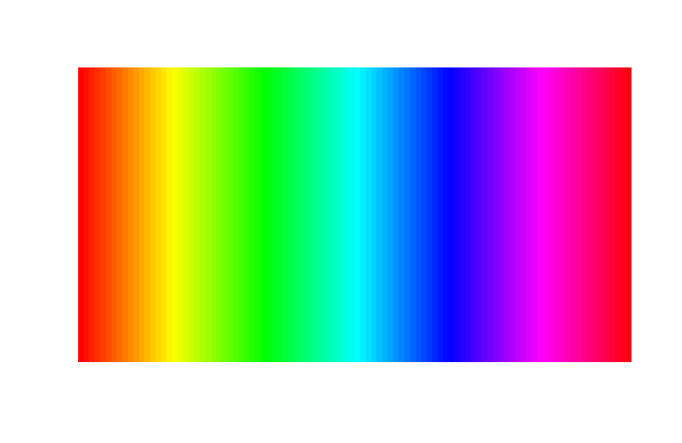
- R basic color palettes: rainbow,heat.colors, cm.colors.
The viridis palette is characterized by its large perceptual range. It uses the available color space as much as possible and is the most robust for various forms of color blindness as well as for the unbiased division of colors.
library(RColorBrewer)
library(colorspace)
clrs_spec <- colorRampPalette(rev(brewer.pal(11, "Spectral")))
clrs_hcl <- function(n) {
  hcl(h = seq(230, 0, length.out = n),
      c = 60, l = seq(10, 90, length.out = n),
      fixup = TRUE)
  }
### function to plot a color palette
pal <- function(col, border = "transparent", ...)
{
 n <- length(col)
 plot(0, 0, type="n", xlim = c(0, 1), ylim = c(0, 1),
      axes = FALSE, xlab = "", ylab = "", ...)
 rect(0:(n-1)/n, 0, 1:n/n, 1, col = col, border = border)
}
pal(clrs_spec(100))

pal(desaturate(clrs_spec(100)))

pal(rainbow(100))
library(RColorBrewer)
display.brewer.all()
# calculate and plot the regression model lm_um
ggplot(nuts3_circles, aes(x = employees, y = universities.means)) +
  geom_point(color = nuts3_circles$employees) +
  scale_color_viridis(option = "D")+
  stat_smooth(method = "lm")
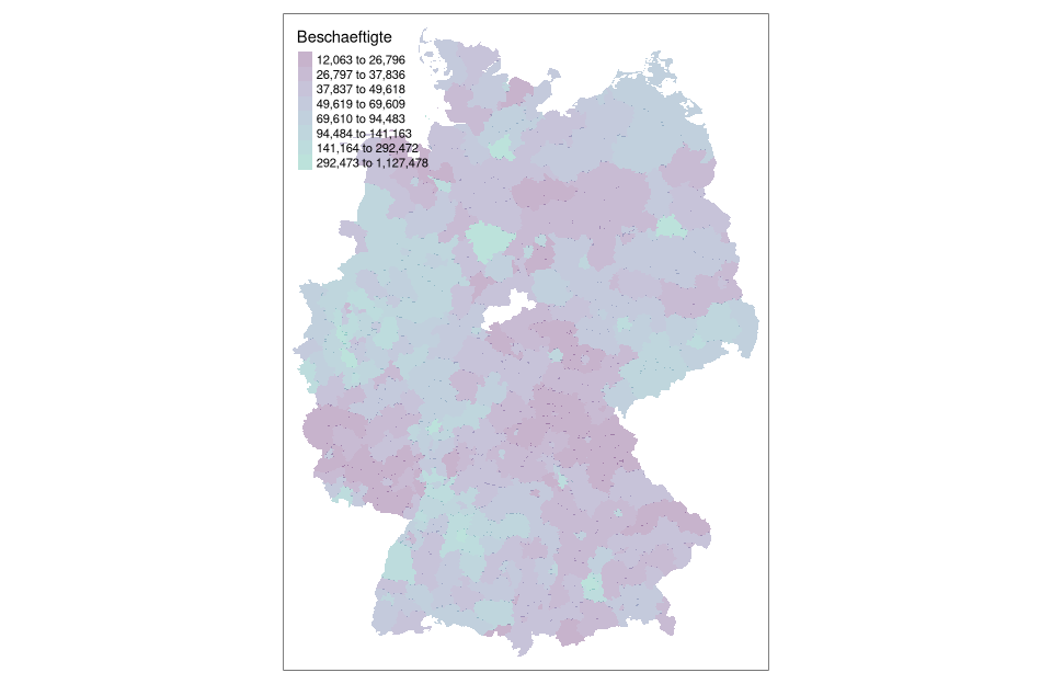
# rendering with tmap coloring by em method with 8 classes using cartography::getBreaks() function
tm_shape(nuts3_circles) +
  tm_fill(col = "employees",breaks = getBreaks(nuts3_circles$employees,nclass = 8,method = "em"), alpha = 0.3,palette = viridisLite::viridis(20, begin = 0, end = 0.56))
Where to find more information?
For more information, the following resources can be looked up:
Download Script
The script can be downloaded from unit05-05_session.R can be downloaded