Data Visualization - 1
Maps are used in a variety of domains to present data in an appealing and interpretive way. Maps are used to communicate information and it is essential to idetify both the certain communication rules of cartography and the basic and required elements. Layout and formatting are the second critical aspect to visually enhance the data. Using R to create maps provides many of these necessities for automated and reproducible cartography.
Spatial analyses and relationships are predominantly communicated as static maps. Static maps (plots) have been the historical R map type. However, other powerful mapping tools have since been developed for R. In particular, interactive web mapping, dynamic mapping, and 3D visualization techniques are a rapidly growing area in the communication of spatial information.
Setting up the environment
rm(list=ls())
rootDIR="~/desktop/spatialstat_SoSe2020/"
## load the needed libraries
# we first define a list with the package names and
# then use a for loop that takes each element from the list
# and see if it is already installed utils::installed.packages()
# if not it will be installed
libs= c("sf", "mapview", "tmap", "spdep", "ineq", "cartography", "tidygeocoder", "usedist", "raster", "kableExtra", "downloader", "rnaturalearthdata")
for (lib in libs){
  if(!lib %in% utils::installed.packages()){
    utils::install.packages(lib)
  }}
# don't be surprised lapply()is a built-in for loop that loads all packages contained in the vector libs
# packages contained in the vector libs by passing the package name as a character string to the
# function library
invisible(lapply(libs, library, character.only = TRUE))
#---------------------------------------------------------
# nuts3_autocorr.R
# Author: Chris Reudenbach, creuden@gmail.com
# Copyright: Chris Reudenbach 2020 GPL (>= 3)
#
# Description: script calculates different autocorrelations from the circle data.
#
#--------------------
##- Loading the circle data
#--------------------

# From session one, the cleaned circle data is loaded from github and read in.

download(url ="https://raw.githubusercontent.com/GeoMOER/moer-mhg-spatial/master/docs/assets/data/nuts3_kreise.rds", destfile = "nuts3_circles.rds")

# read in the nuts3_circles data
nuts3_circles = readRDS("nuts3_circles.rds")

# The same for the point data of the cities
download(url ="https://raw.githubusercontent.com/GeoMOER/moer-mhg-spatial/master/docs/assets/data/geo_coord_city.rds", destfile = "geo_coord_city.rds")

# download the city data
geo_coord_city = readRDS("geo_coord_city.rds")

# for demo purposes a raster dataset (Corine data for Germany is downloaded and read in)

download(url ="https://raw.githubusercontent.com/GeoMOER/moer-mhg-spatial/master/docs/assets/data/lulc_nuts3_kreise.tif", destfile = "lulc_nuts3_kreise.tif")
lulc_nuts3_kreise = raster("lulc_nuts3_kreise.tif")
Static maps with tmap
Concept
There are also conceptual differences with respect to the mapping tools in R. tmap, like ggplot2, follows the paradigm of digital cartography named grammar of graphics by Wilkinson and Wills (2005). This approach takes some getting used to at first, but with a little practice it is extremely powerful and transparent, and optimal for producing high quality maps automatically in a very short time.
The most important conceptual point is the separation of the data to be displayed and how that data is to be visualized. For the cartographic representation each data set can be visualized modularly in the appropriate way. This includes the map layout, the projection and all cartographic elements including the visual variables.
Initial example tmap
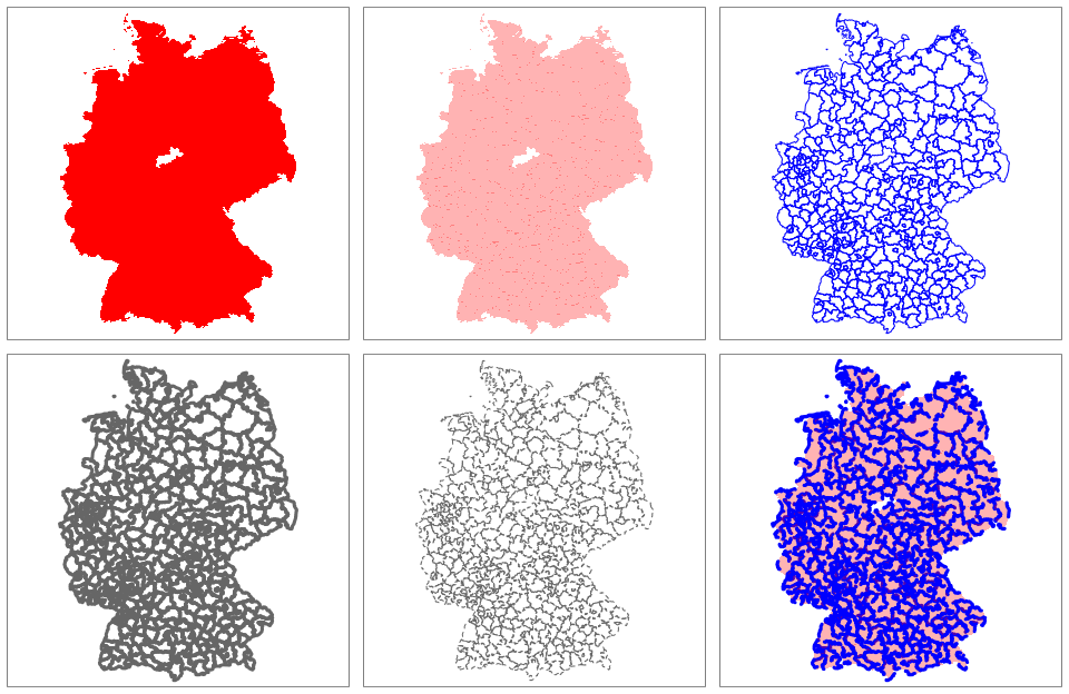
In tmap, the basic function for defining the dataset is tm_shape(). This function is used to define the input data. Both data models (raster and vector data) can be used. The base function that defines the data must always be supplemented by at least one or more functions that provide for the cartographic tuning of the display. These layer elements (e.g. tm_fill(), tm_dots() or tm_polygons()) create “slide” by slide the actual map.
# definition of nuts3_circles with the request to fill this area
tm_shape(nuts3_circles) +
  tm_fill()
# create geometries
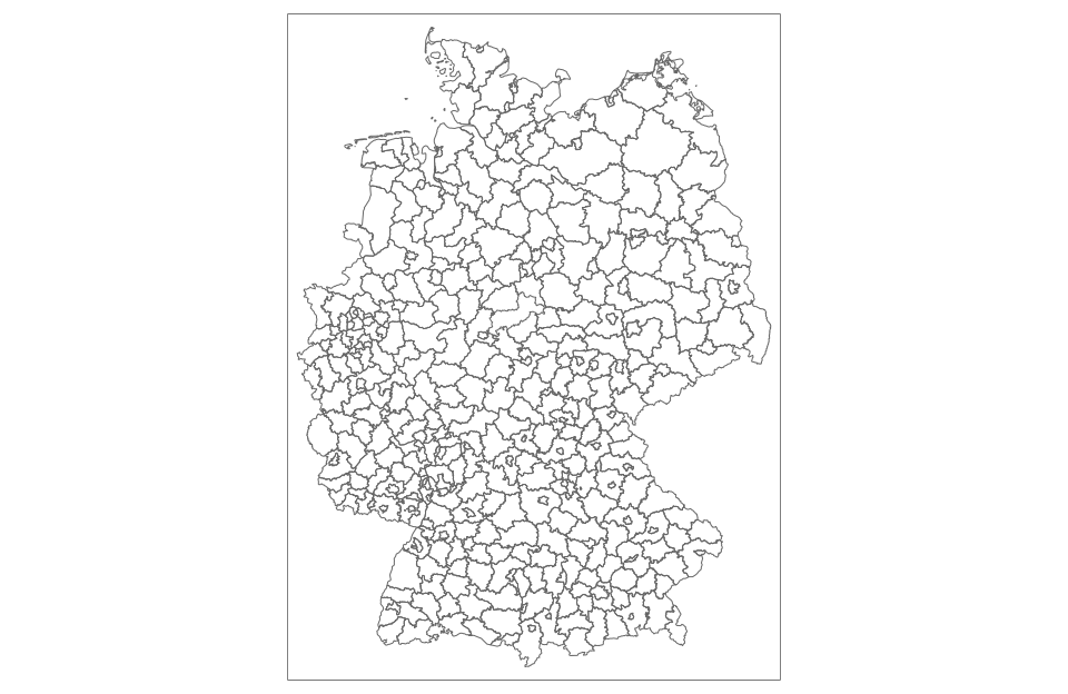
tm_shape(nuts3_circles) +
tm_borders()
# fill and display the geometries
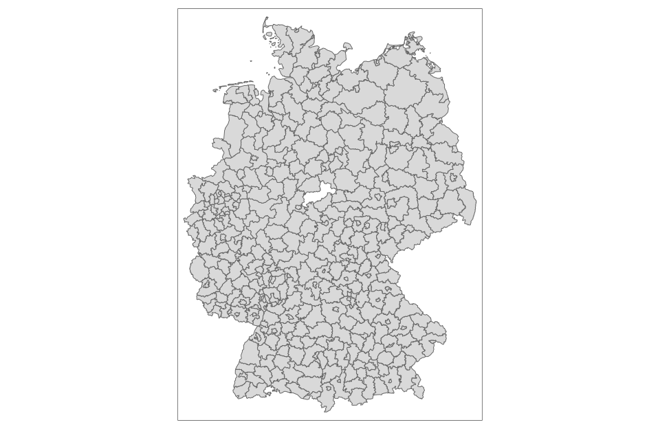
tm_shape(nuts3_circles) +
tm_fill() +
tm_borders()

# abbreviation with the convenience function qtm
qtm(nuts3_circles)
What happens?
The data object passed to tm_shape() is nuts3_circles our known sf object. then the single layers are added where tm_fill() and tm_borders() fill the object with the default color and default line width and represent the geometries respectively. Adding new layers is done by the + operator followed by tm_*() (* stands for all available layer types, see the “tmap-element” help for a complete list). The function qtm() (for quick thematic maps) often provides a good convenience function for generating a suitable map base.
The result can of course be stored in a variable in the usual R way.
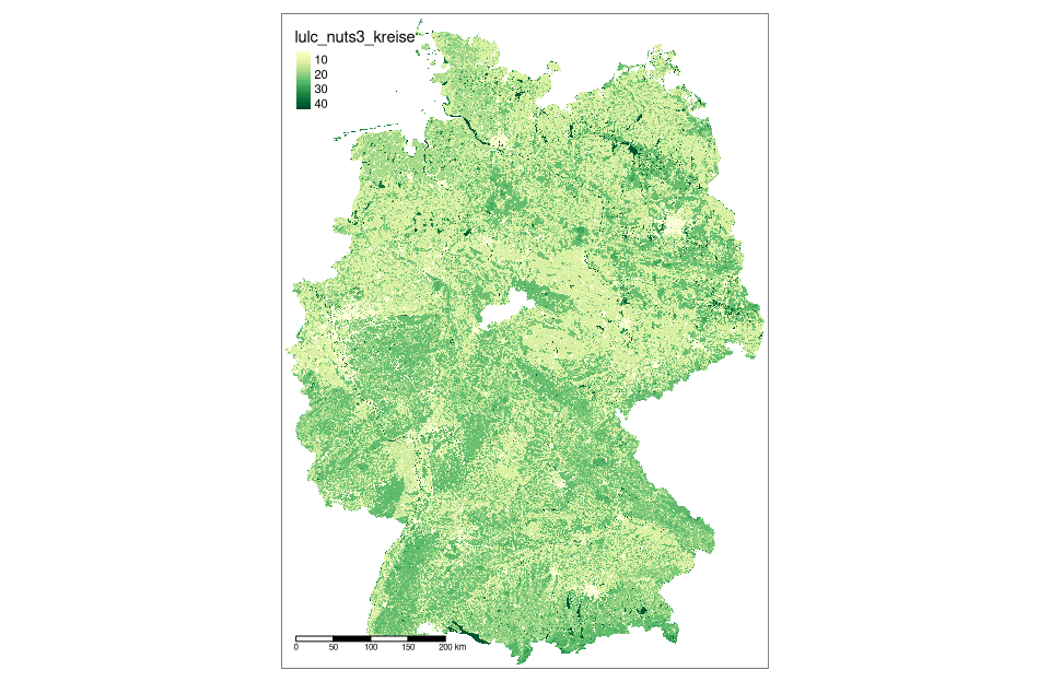
Land use data Germany as raster data map
map_nuts3_kreise = tm_shape(lulc_nuts3_kreise)

map_nuts3_kreise + tm_raster(style = "cont", palette = "YlGn") +
  tm_scale_bar(position = c("left", "bottom"))
Basics of map design
In principle, there are two different categories of design options in a map: design that can be changed with the data (features) and constant values. tmap accepts arguments involving either variable data fields (based on column names) or constant values.
The most commonly used aesthetics arguments for fill and border layers include color, transparency, line width, and linetype, which are specified with the col, alpha, lwd, and lty arguments, respectively.
tmap_mode("plot")
map1 = tm_shape(nuts3_circles) + tm_fill(col = "red")
map2 = tm_shape(nuts3_circles) + tm_fill(col = "red", alpha = 0.3)
map3 = tm_shape(nuts3_circles) + tm_borders(col = "blue")
map4 = tm_shape(nuts3_circles) + tm_borders(lwd = 3)
map5 = tm_shape(nuts3_circles) + tm_borders(lty = 2)
map6 = tm_shape(nuts3_circles) + tm_fill(col = "red", alpha = 0.3) +
  tm_borders(col = "blue", lwd = 3, lty = 2)
tmap_arrange(map1, map2, map3, map4, map5, map6)
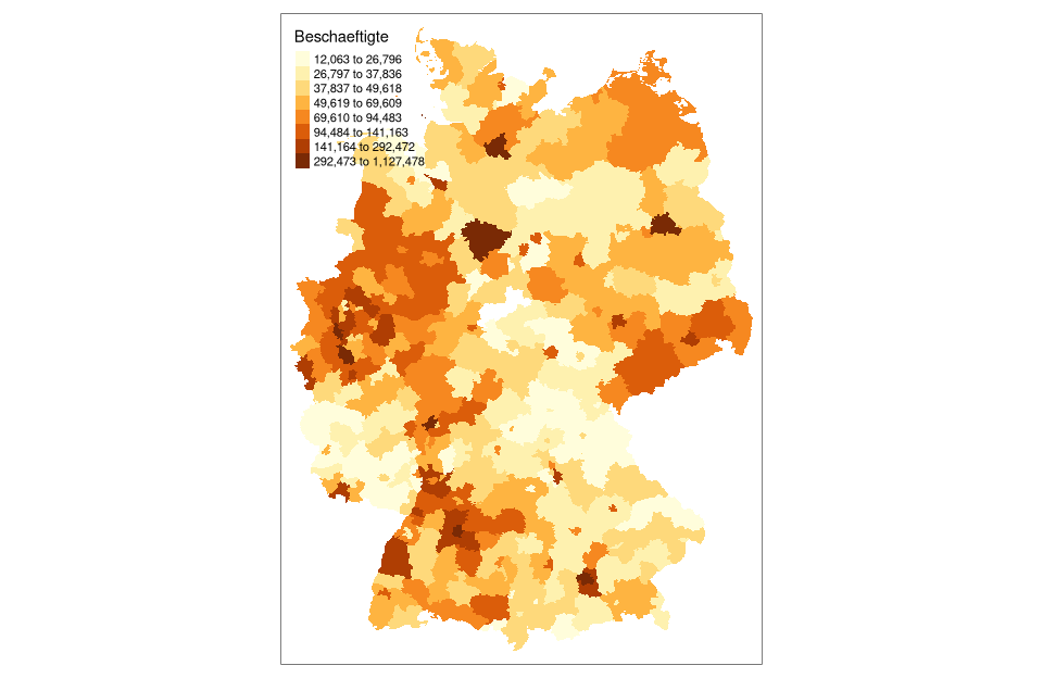
Labels and visual classification
# default settings
tm_shape(nuts3_circles) +
  tm_fill(col = "employed")
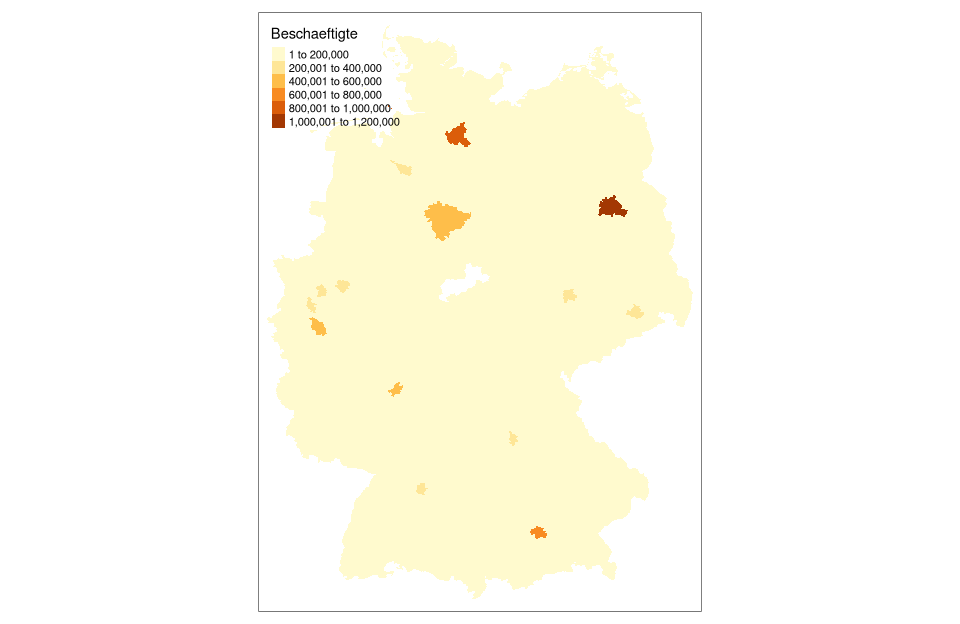
# display with tmap coloring according to equal class spacing
tm_shape(nuts3_circles) +
  tm_polygons("Beschaeftigte", breaks=seq(0,1250000, by=150000))
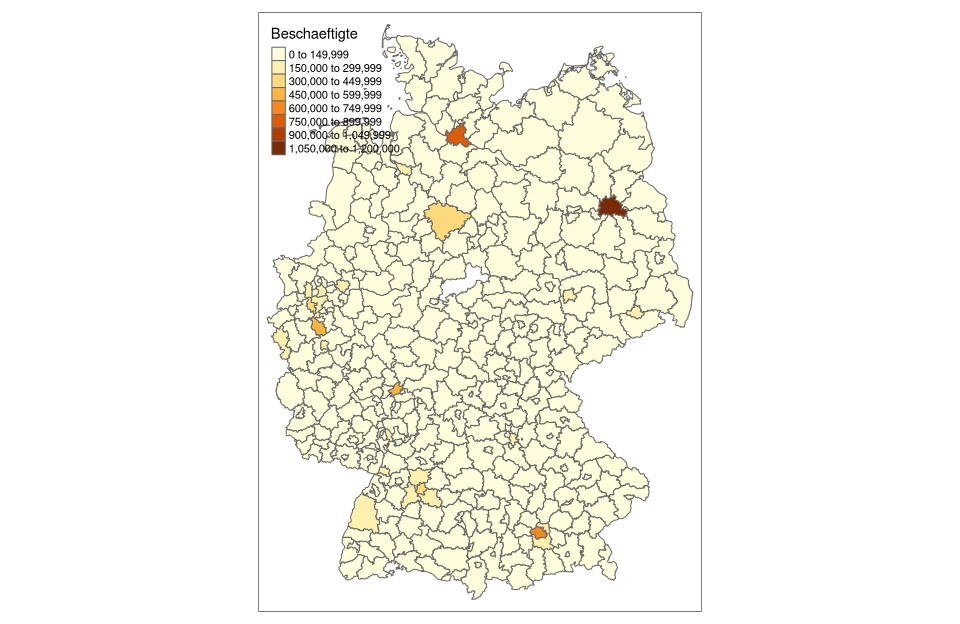
# rendering with tmap coloring according to Jenks method with 8 classes using cartography::getBreaks() function
tm_shape(nuts3_circles) +
  tm_fill(col = "employees",breaks = getBreaks(nuts3_circles$employees,nclass = 8,method = "jenks"))
# rendering with tmap coloring by em method with 8 classes using cartography::getBreaks() function
tm_shape(nuts3_circles) + tm_fill(col = "employees",breaks = getBreaks(nuts3_circles$employees,nclass = 8,method = "em"))
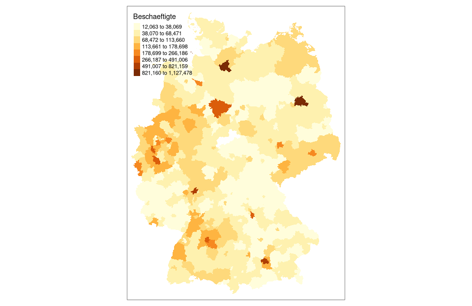
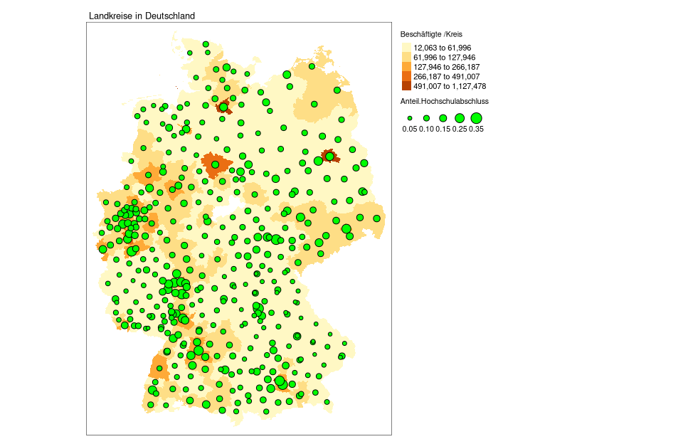
# display with tmap coloring according to Jenks with 5 classes using tmap's own function from tm_fill()
# for this purpose title and legend are displayed outside and another dataset (share.university degree) is overlaid
legend_title = expression("employed /county")
tm_shape(nuts3_circles) +
  tm_fill(col = "employees",title = legend_title, style = "jenks" ) +
  tm_layout(main.title = "Counties in Germany",legend.outside = TRUE,main.title.size = 0.8,legend.title.size = 0.8) +
  tm_symbols(col = "green", border.col = "black", size = "Proportion.of university degrees")
What else can be done?
Once we have our table data as geotable data (e.g. nuts3_circles as sf object) we can access powerful packages for visualisieurng and on the fly analysis. As an example tmap is shown here.
- try the linked ressources.
- ask questions by email with the subject [GISFE].
Where can I find more information?
For more information, you can look at the following resources:
-
Spatial Data Analysis by Robert Hijmans. Very comprehensive and recommended. Many of the examples are based on his lecture and are adapted for our conditions.
-
Geocomputation with R by Robin Lovelace, Jakub Nowosad, and Jannes Muenchow is the outstanding reference for everything related to spatiotemporal data analysis and processing with R.
-
Making Maps with R provides a very useful introduction to the topic.
-
rayshader documentation gives a great introduction to 3D mapping using the
rayshaderpackage. -
rnaturalearth documentation a convinient wrapper for the Natural Earth public domain map dataset.
-
ggmap package a collection of functions to visualize spatial data and models - works also with open source data.
Download Script
The script can be downloaded from unit05-03_session.R can be downloaded